Yes, 490 onboarded in the first 5 months from product launch. Even If you build a product or service that has real value, you’re still just getting started. Until people discover, understand, and believe in what you have to offer, you alone are the user.

How did we do it?
I’m going to share with you 10 of our key onboarding tactics that have been successful.
490 websites over 5 months equate to a little over 3 new websites per day on average. AdNgin grew way beyond that shortly thereafter and continued to grow until the Outbrain acquisition in late 2018.
Top 10 onboarding tactics for the B2B sales funnel
If you skim the list below too quickly, you might run the risk of misunderstanding them as just the basics. However, people do the “basics” all the time and don’t achieve the same results.
What’s different here?
If you’re interested in emulating AdNgin’s strategies and successful onboarding process, give some thought to the finer details of how I used each marketing asset below:
- SAAS Sales Funnelling
- Blog Lead Generation
- Popup Distribution
- Funnel Advancement
- Available Pricing
- Lifetime Free Account
- All “About” Trust
- Copywriting
- Case Studies
- Direct Onboarding
1. SAAS sales funneling
Let’s get real for a second. Professionally designing a marketing website is no longer the big challenge.
What I have observed is that the real challenge is understanding how your website / landing page functions as the axis of your full marketing funnel and how your users interact with it.
This includes multiple lead generation entry points. AdNgin’s website was our digital marketing hub, which to be honest, is the case with many similar startups.
For simplification purposes, most web funnels tend to be visualized as just one big funnel — taking in leads and narrowing to customer conversions.
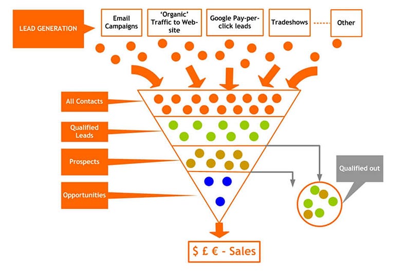
Courtesy of Stipso
Adding another level of complication are the subscription funnels that “go both ways”:

But these type of funnels symbolize a frictionless system of user onboarding, which it really is not.
A more accurate depiction would have not only multiple entry points but multiple funnels pointing leads in different directions personalized for their specific needs.
The classical funnel is great for showing how signups progress from new to qualified prospect to fully onboarded user but here’s a visualization of what you’re really up against:
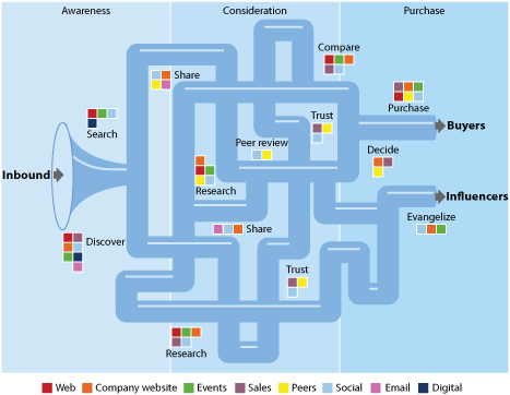
Courtesy of ChiefMarTech
2. Blog lead generation
AdNgin’s key traffic driver was always the blog. And the vast majority arrived organically. I do not mean they fell off a pesticide free vegetable delivery truck. I just mean they googled for a search term and one of our blog posts appeared or via organic social media like in one of the many webmaster forums I was active in at the time.
The alternative is usually via an ad click where I paid for the privilege of making their acquaintance, each and every time.

I decided right from the beginning that our focus would be on inbound marketing. And our blog was structured as the main engine for our inbound traffic and leads.
Here’s your reality check. I ran an active blogging schedule. Our traffic wasn’t an immediate avalanche. However, it was recurring, accumulating, and grew relatively quickly as I refined our content marketing strategy.
An example of a successful content marketing tactic
For the first few months, our blog ran without much notice. I was producing “quality” content — unique, ever-green, over 1200 words blog posts that weren’t getting noticed.
Until, our 7 Essential Success Factors to Adopt from 12 Killer Blogs post changed all that. Side note: it has unfortunately been deprecated along with the rest of the AdNgin website following the Outbrain acquisition.
Why was this one different?
Well, the post provided a unique and thoughtful analysis of a few very successful blogs. But, more importantly, it pulled the curtain and revealed the behind the scenes strategies of the people who are akin to celebrities in the pro blogging world.
That topic resonated with our audience, and it was so well targeted to them it spiked our traffic and conversions.

But the most important part was that some of the experts I featured shared the post on social media.
This generated buzz around the post and got it to go viral…I’m not talking buzzfeed here but viral by our own standards up till that point… Like this tweet below that went out to @CMIContent’s 168,000 followers:
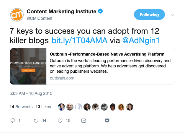
Instantly AdNgin gained a few dozen new Twitter followers and, more importantly, Google started to pay attention too. So if you take away one piece of advice from this post so far it would be:
write a unique and thorough post that features influencers in a flattering way. Then, point their attention to it. If the writing is engaging and the analysis — thought provoking, you have a very good chance they will share it.
In matters of formality, be aware that we did have a style guide and paid heavy attention to SEO tactics.
However, it’s the most whitehat of strategies that served us the best. We chose highly targeted topics. Then I wrote about each of them in enough detail (including related keywords) that both web visitors and search engines alike recognize us as great info sources.
If you use those principles, the rabbit hole of complex SEO approaches isn’t something you have to get sucked into. However, SEO results are also much easier to achieve when you start out with a laser focused understanding of your target audience and the content that will serve them best.
3. Pop up domination
Popups work! A carefully structured message delivered in a timely way… converts. However, I did not want to require our incoming users to have to search for these lead gen triggers.
Basically, a pop-up can pancake your marketing funnel into a single stage. Every page becomes a landing page. For better and for worse. For example, our newsletter registration pop up was converting from the onset.
This led us to create an experiment of utilizing the popup lead generation strategy through our entire website. That’s something we actively split tested and saw positive results for.

Why did we do it?
When your incoming traffic may have only seconds, you can’t be certain you’ll advance them effectively down the funnel to one particular lead conversion area.
So test converting them where they are… including on some of the main pages of your website. It’s not just about your blog anymore.
Here’s the thing though. pop-ups on your homepage or pricing page can have a negative effect on user experience and on your conversions.
I recommend starting out by testing on a small proportion of your traffic and using different triggers that aren’t too UX negative such as exit intent.
4. Call-to-action optimization
Your entire website has to be structured around advancing users through your funnel. As I noted, a big part of how we convert leads is through our pop up strategy.
It’s true that popups can be annoying sometimes. However, when there is a perception of annoyance, it has common roots:
Popups are annoying when they are not highly targeted to the user’s intent.
Pop-ups ask the reader to stop what they’re doing right now and perform a different action they did not intend to perform before….Ish. That’s hard to do but not impossible. The secret is to optimize your pop-ups to find the sweet spot where you can maximize conversions while maintaining a positive user experience.
That’s the theory behind exit intent pop-ups but they don’t always work. So I tested for:
- Timing
- Placement
- Message
- CTA
- Fields
How did know when I found the sweet spot between user experience and conversion rates?
The sweet spot was found when our visitors converted at a high rate and they didn’t leave, quickly anyway:
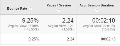
I ran optimization tests not only through our pop-up provider (SumoMe) but also through our A/B testing platform (Optimizely) where we also tested for the best performing calls to action and content layouts.
For instance, we found that START NOW drives 87% more demo requests than the more obvious REQUEST A DEMO.
When you arrive at AdNgin, I tried to deliver the pop ups that provided the closest fit with the visitor’s intent. Our focused content strategy was instrumental in making that happen. Of course, I like memes and fun stuff too — as you may or may not have noticed.
But as cool as the gangster, knife wielding crab is… if he makes it to our site, he has to relate to the topic. If you don’t believe us, just ask him.

5. Provide pricing
If you’re making a great pitch, one of the most frequent questions your visitor will have is: “How much?”
Before, we were strictly a “Request a demo” operation. The website did not provide any information on pricing or features per package.
By not having a pricing page, users were not aware that we offered a “Starter” package that is free for life. They had to go through the process of booking and attending a demo to find out, which obviously hurt our onboarding process.
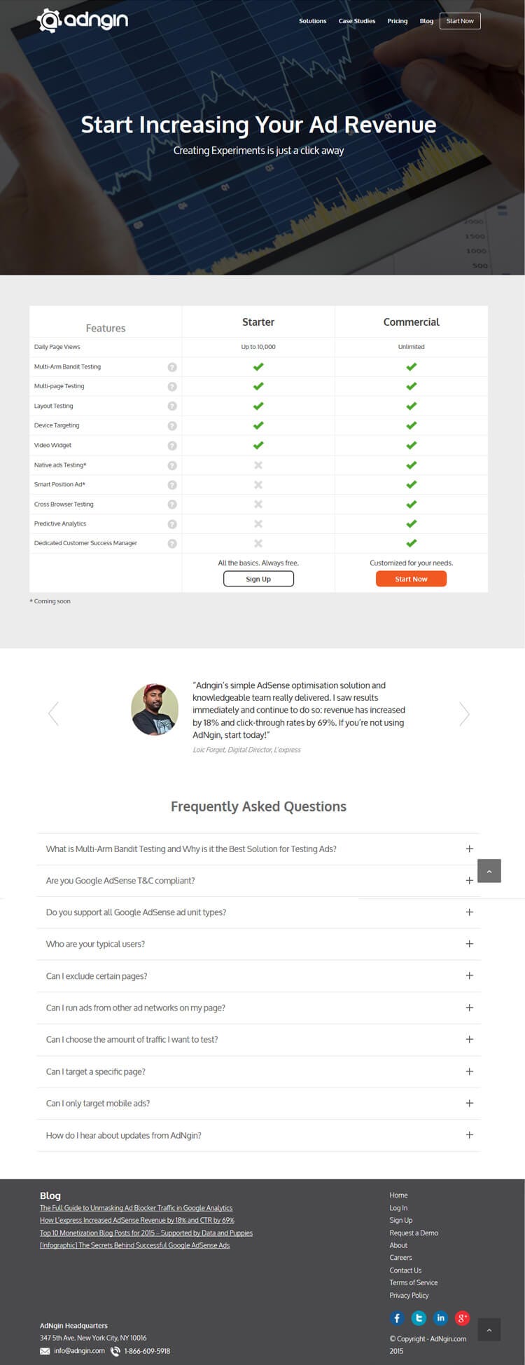
Bottom line, we realized we had made a mistake by making key decision making information too hard to find.
6. Lifetime Free Account
As I noted, our Starter account was free for life. A strategy like this is only possible because we knew that AdNgin will help our users grow and that one day they will be ready for a paying package.
And for the rest, we invited them to continue using the capabilities of our free account for as long as they would like. Paid accounts would trigger once a certain traffic level or ad revenue threshold were reached.
When to offer freemium?
I’m sure some of you are reading this now and going: “that wouldn’t work for me”, and I’m not suggesting it would. I do recommend offering a version of a free solution in any of the following cases:
- You need users to establish product market fit (this could be for stuff like pricing and new features too)
- You have a “sticky” product that is benefited from users using it before they purchase
- You have a product that requires user evaluation as part of the process
- You have a product that is all of the above and is relatively easy to onboard and use
- Many, if not most, of your direct competitors offer a free version
7. All “About” Trust
Pricing was a good example. When we make that information available, we send a signal that we’re open about what we’re offering. In a noisy eco-system, simple and straightforward pricing generates trust and, just having it, can provide an edge in some cases.
During our demos with potential users, we also noticed that they were very interested in learning who we are, why Amon, the co-founder, created AdNgin, and how we see our future. So we added an about page to the website:
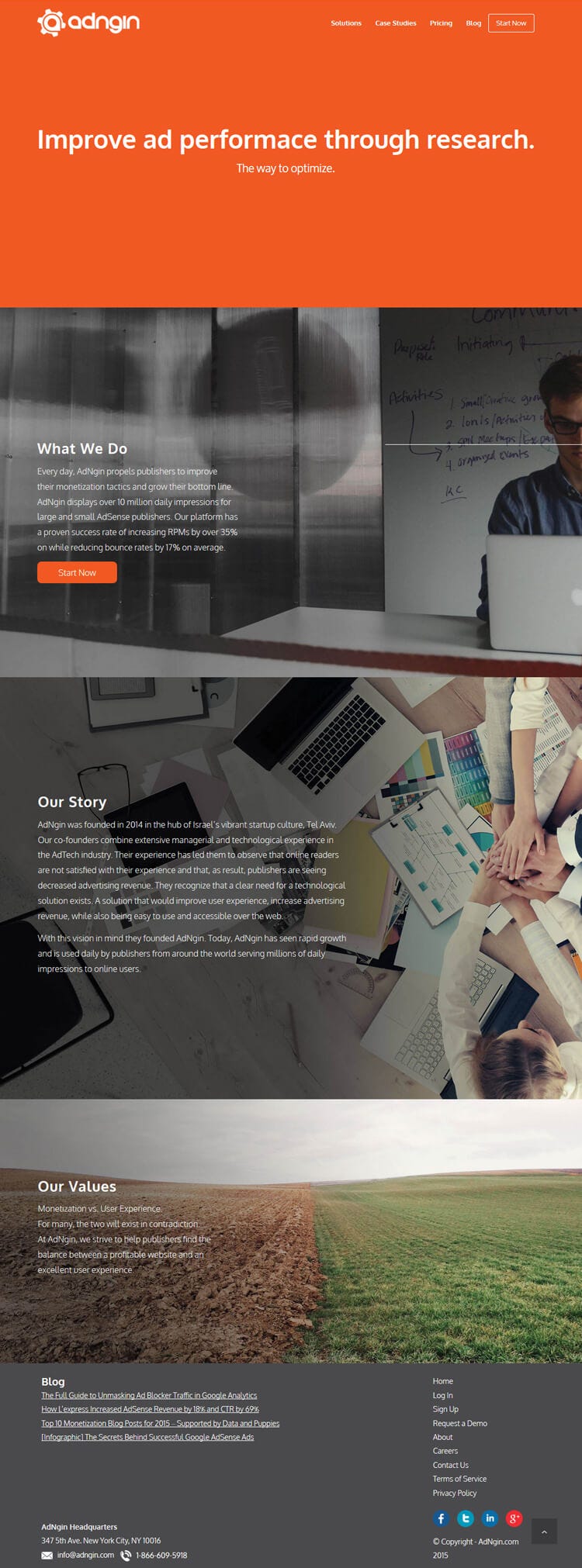
Though it wasn’t a short story, it acted as a perfect nutshell of who we were and what we stood for.
If you read “Our Story” you may have noticed that we stated we were in one of the world’s hottest startup markets, here in Israel, and that our team had extensive tech and AdTech backgrounds. That was not only meant to educate the reader but also create a certain level of expectation that we’re very focused and fully invested in this platform.

These are the kinds of short but powerful introductions that help to develop both trust and authority. And, it can be the info that makes the difference in getting your visitors to onboard . They may like your idea, but need to know why you’re the team to deliver on those promises.
When people read our About page, they got to know why the AdNgin team is one they could be confident in. Don’t forget to send that trust signal to your users.
8. Copywriting
First, we used a style guide that was applied across the entire website and delivered a consistent message. Second, I tried to choose interesting topics to write about by always being in tune with the industry trends. And third, we wrote with SEO in mind.
This isn’t too heavy reading, right? That’s because we targeted our blog writing to be informative, but also conversational. We wanted to provide value without making the reading too dull.
So since we’re talking copywriting, we’ll put it in as few words as possible: Know your audience, very well, and be consistent.C
9. Case Studies
There are really two types of web visitors. Those who experience instant narcolepsy when they read the word “case study” and those that almost spill their coffee with joy.
For AdNgin, I felt that case studies played a very specific role. I treated it as a recognition that many users wanted data and formal analysis of the results we claimed to offer. Keep in mind that these are very particular readers. Most likely, they’re already aware of your brand and are looking for trust signals to show that what you say you can do…you can actually do, and have done, over-and-over again.
As your leads move further down the sales funnel, case studies become more and more valuable. It makes the proposition of what you’ve described become a reality.
You’re describing not only what you can do, but what you have actually done. And you have the data to support it. It’s a way to create and manage expectations.
Case studies can be that necessary push that one needs to fall down the funnel. It’s a key resource that compels a user into making that onboarding conversion. Keep in mind, that most of your paying users are going to check out some of your case studies at one point or another.
10. Direct Onboarding
When it comes to onboarding new customers, we found that a balance between a formal enterprize-style onboarding approach, and one that is more direct works best. So we made that transition.
Granted, that is also a measure of self-confidence in knowing our users were highly targeted, and that our software user interface was professionally designed. We knew that a look inside of the AdNgin platform will let users experience what we offer in an intuitive way.
Once users explore on their own, they can come to us with questions. And they’ll be more open to us following up to check in on how they are doing, or if they need help with anything.
Having a demo just got in between their initial early interest and actually trying it. Demos were actually costing us leads. By going direct, and removing that point of friction in the signup process, we were getting better conversions further down the funnel.
How are you doing with your onboarding?
So those are some of the key factors that helped us onboard the first 490 websites to the AdNgin platform in 5 months. I encourage you to leverage them in your web marketing funnel.
Actually, let’s talk about how I can help you with that

The Founder & Chief Getting Sh%T Done Officer of mvpGrow. After about 8 years as a hired hand some of the largest (and smallest) B2B SaaS companies worldwide I decided to hang up my employee slippers and lace up my growth agency cleats. But just because I’m an agency doesn’t mean we can’t chat (no charge). Please email me on any topic and I will gladly reply: eyal@mvpgrow.com
